The graph below shows the average cost of renting a studio in one city in each of the years 2002 through 2006. By what percentage does the average price increase from 2002 to 2003?
Obtain a second version of the graph by sliding a piece of paper over the bottom of the graph so that the bars start at 300. In this new graph, by what percentage does the price appear to increase from 2002 to 2003? Is the second graph misleading? 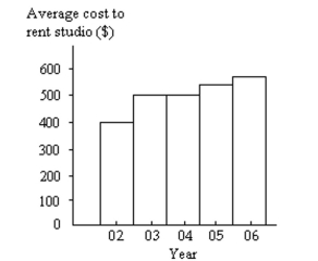
Correct Answer:
Verified
View Answer
Unlock this answer now
Get Access to more Verified Answers free of charge
Q1: Provide an appropriate response.
-Histograms and Pareto charts
Q10: Provide an appropriate response.
-Create an example displaying
Q19: The following histogram shows average SO2 (sulfur
Q21: Use the given data to construct
Q23: Use the given data to construct
Q25: Use the high closing values of
Q26: The frequency table below shows the
Q27: The following frequency distribution analyzes the
Q28: Use the given data to construct
Q29: The graph below shows the number of
Unlock this Answer For Free Now!
View this answer and more for free by performing one of the following actions

Scan the QR code to install the App and get 2 free unlocks

Unlock quizzes for free by uploading documents