The graph below shows the number of car accidents occurring in one city in each of the years 2001 through 2006. The number of accidents dropped in 2003 after a new speed limit was imposed. Does the graph distort the data? How would you redesign the graph to be less misleading? 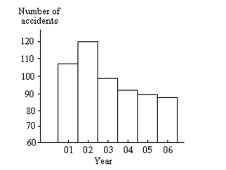
Correct Answer:
Verified
View Answer
Unlock this answer now
Get Access to more Verified Answers free of charge
Q24: The graph below shows the average cost
Q25: Use the high closing values of
Q26: The frequency table below shows the
Q27: The following frequency distribution analyzes the
Q28: Use the given data to construct
Q31: The frequency table below shows the
Q32: Construct a frequency distribution that includes an
Q33: Use the given paired data to
Q35: Solve the problem.
-Suppose that you construct a
Q40: Solve the problem.
-Construct a frequency distribution and
Unlock this Answer For Free Now!
View this answer and more for free by performing one of the following actions

Scan the QR code to install the App and get 2 free unlocks

Unlock quizzes for free by uploading documents