Chocolate or vanilla: The following bar graph shows the number of chocolate and vanilla ice cream cones sold during the annual county fair for the years 2013 - 2017. Does the graph present an accurate picture of the difference between chocolate and vanilla cones sold? Or is it misleading?
Explain. 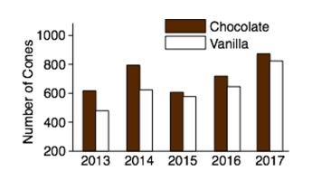
Correct Answer:
Verified
Q29: The following time-series plot presents the population
Q30: Helium prices: The cost of grade A
Q31: A sample of 200 high school
Q32: A sample of 200 high school
Q33: Toy sales: The following graph presents the
Q35: Construct a dotplot for the following
Q36: The following table presents the rate
Q37: The amounts 3 and 4 are compared.
Q38: The amounts 3 and 2 are compared.
Q39: Construct a stem-and-leaf plot for the
Unlock this Answer For Free Now!
View this answer and more for free by performing one of the following actions

Scan the QR code to install the App and get 2 free unlocks

Unlock quizzes for free by uploading documents