The scatterplot shows monthly sales figures (in units) and number of months of experience for a sample of salespeople. 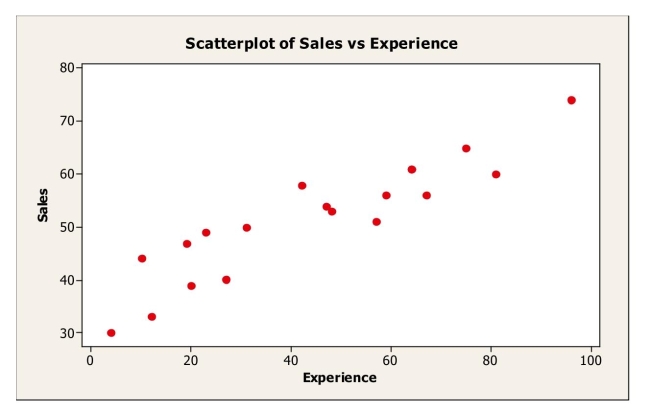 The correlation between monthly sales and level of experience is most likely
A) -.235.
B) 0.
C) .180.
D) -.914.
E) .914.
Correct Answer:
Verified
Q2: The following scatterplot shows monthly sales figures
Q3: A company studying the productivity of its
Q4: Shown below is a correlation table showing
Q5: The scatterplot shows monthly sales figures (in
Q6: A small independent organic food store offers
Q8: Shown below is a correlation table showing
Q9: Data were collected on monthly sales revenues
Q11: Use the following to answer questions
To
Q12: A study examined consumption levels of oil
Q18: A supermarket chain gathers data on the
Unlock this Answer For Free Now!
View this answer and more for free by performing one of the following actions

Scan the QR code to install the App and get 2 free unlocks

Unlock quizzes for free by uploading documents