This table shows the number of people who exercised for various amounts of time (from 0 to 7 hours) per week. This type of graphic representation of data is called a _____. 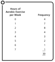
A) frequency distribution
B) frequency polygon
C) histogram
D) scatter plot
Correct Answer:
Verified
Q12: This graphic representation of the data from
Q13: Data from the health promotion study described
Q14: The type of statistics used to organize,
Q15: A _ distribution is a symmetrical, meaning
Q16: This graphic representation of the data from
Q18: When Mrs. Sanderson plotted the math test
Q19: After the first quiz in Psychology 101,
Q20: A _ is a graphic representation of
Q21: The _ is an example of a
Q22: Fifty students took the midterm exam in
Unlock this Answer For Free Now!
View this answer and more for free by performing one of the following actions

Scan the QR code to install the App and get 2 free unlocks

Unlock quizzes for free by uploading documents