Figure: Unemployment Rate over Time
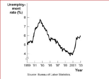
 (Figure: Unemployment Rate over Time) Look at the figure Unemployment Rate over Time.In the time-series graph, as we move from the beginning of 2001 to the beginning of 2003, we see that the unemployment rate has:
A.decreased from approximately 5% to approximately 4%.
B.increased from approximately 5.3% to approximately 7.3%.
C.decreased from approximately 7.7% to approximately 5.5%.
D.increased from approximately 4% to approximately 6%.
Correct Answer:
Verified
View Answer
Unlock this answer now
Get Access to more Verified Answers free of charge
Q38: Figure: Slope Q39: Figure: Demand and Supply Q40: Figure: Slope Q41: Figure: Seasonally Adjusted Unemployment Rate Q43: Use the following to answer questions : Q44: Figure: Seasonally Adjusted Unemployment Rate Q45: Figure: Seasonally Adjusted Unemployment Rate Q46: Figure: Unemployment Rate over Time Q48: Figure: Labor Force Participation Rate Q50: Use the following to answer questions :
![]()
![]()
(Figure: Slope) Look at the figure
(Figure: Seasonally Adjusted
(Figure: Seasonally Adjusted
(Figure: Seasonally Adjusted
(Figure: Unemployment Rate

Unlock this Answer For Free Now!
View this answer and more for free by performing one of the following actions

Scan the QR code to install the App and get 2 free unlocks

Unlock quizzes for free by uploading documents