The graph shown demonstrates the domestic demand and supply for a good, as well as a tariff and the world price for that good. 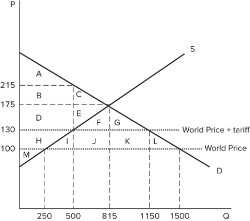 Which areas represent the amount of deadweight loss that would be created by the imposition of the tariff?
A) I + L
B) J + K
C) I + J + K + L
D) F + G + J + K
Correct Answer:
Verified
Q101: The graph shown demonstrates the domestic demand
Q102: The graph shown demonstrates the domestic demand
Q103: The graph shown demonstrates the domestic demand
Q104: The graph shown demonstrates the domestic demand
Q105: The graph shown demonstrates the domestic demand
Q107: The graph shown demonstrates the domestic demand
Q108: The graph shown demonstrates the domestic demand
Q109: The graph shown demonstrates the domestic demand
Q110: The graph shown demonstrates the domestic demand
Q111: The graph shown demonstrates the domestic demand
Unlock this Answer For Free Now!
View this answer and more for free by performing one of the following actions

Scan the QR code to install the App and get 2 free unlocks

Unlock quizzes for free by uploading documents