The graph given below compares the GDP of a country with the country's energy consumption. Analyze the graph and identify a statement that is true for the years 2010-2015. 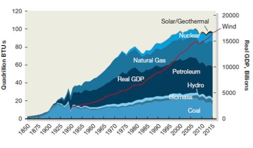
A) The country's GDP has increased with energy consumption.
B) The country's GDP has decreased with energy consumption.
C) The country's GDP has increased irrespective of its energy consumption.
D) The country's GDP has decreased irrespective of its energy consumption.
Correct Answer:
Verified
Q2: Apetates, a food processing company, wants to
Q3: Which of the following statements is true
Q4: Adam, Ryan, Jason, and Stephen argue about
Q5: Which of the following statements is true
Q6: Zencorp, an information technology firm, is an
Q7: Kidjois, a plastic toy manufacturing company in
Q8: The energy industry of Zaneland, with the
Q9: The e-commerce sector of Belwick has implemented
Q10: Power Tree, a thermal power plant, provides
Q11: Which of the following companies is most
Unlock this Answer For Free Now!
View this answer and more for free by performing one of the following actions

Scan the QR code to install the App and get 2 free unlocks

Unlock quizzes for free by uploading documents