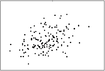
The first scatter diagram below shows a stronger linear relationship than the second scatter diagram. (Assume the scales on both scatter diagrams are the same.) 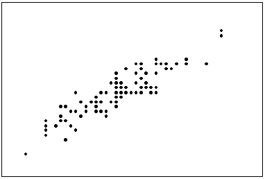
Correct Answer:
Verified
Q7: Time series data are often graphically depicted
Q8: For what type of data are frequencies
Q53: The scatter diagram below depicts data with
Q55: The graph below represents a line graph.
Q55: A line chart is created by plotting
Q60: A line chart that is flat shows
Q60: The line chart below shows cucumber prices
Q84: If two variables have a strong linear
Q96: If we draw a straight line through
Q100: The two most important characteristics to examine
Unlock this Answer For Free Now!
View this answer and more for free by performing one of the following actions

Scan the QR code to install the App and get 2 free unlocks

Unlock quizzes for free by uploading documents