Match the following figures with the most appropriate statement.
<table style="font-family: 'times new roman'; font-size: 11pt; color: #000000; font-weight: normal; left:2px; top:19px; width:744px; height:489px;" summary="An illustration shows 3 graphs and 2 photos.
The graph A with an accompanying photo of the sheep shows the horizontal axis that represents the percentage of lifespan from 0 to 100 with increments of 50. The vertical axis represents the numbers surviving from 0 to 1000 with 10 and 100 in between. The curve starts from 1000 at vertical axis moves steadily and then falls down to 100%. Pink dots are shown along the lines of the curve.
The graph B with an accompanying photo of a desert shrub shows the horizontal axis that represents the percentage of life span from 0 to 100 with increments of 50. The vertical axis represents the numbers surviving from 0 to 1 million with 100 and 10,000 in between. The curve starts from 1million and falls down along the vertical axis to 100 and moves steadily towards the horizontal axis. Pink dots are shown along the lines of the curve.
The graph C with an accompanying photo of a lizard shows the horizontal axis represents the percentage of life span from 0 to 100 with increments of 50. The vertical axis represents the numbers surviving from 0 to 1000 with 10 and 100 in between. A straight line is seen across the graph that begins at 1000 and ends at 100. Pink dots are seen along the line.
The photo D shows a black fly laying eggs on a tomato.
The photo E shows two whales swimming in the water.">
A. 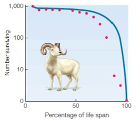
B. 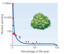
C. 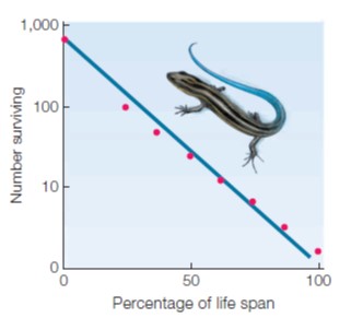
D. 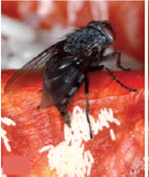
E. 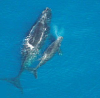
Correct Answer:
Q90: Match the following terms with the
Q91: Match the following terms with the
Q92: Match the following terms with the
Q93: Match the following terms with the
Q94: Match the following terms with the
Q95: Match the following terms with the
Q96: Match the following figures with the most
Q97: Match the following figures with the most
Q98: Match the following figures with the most
Q99: Match the following figures with the most
Unlock this Answer For Free Now!
View this answer and more for free by performing one of the following actions

Scan the QR code to install the App and get 2 free unlocks

Unlock quizzes for free by uploading documents