The following graph shows U.S. demand for and supply of a good. Suppose the world price of the good is $1.00 per unit and a specific tariff of $0.50 per unit is imposed on each unit of imported good. In such a case, net welfare loss as a result of a tariff of $0.50 per unit is represented by the area ____.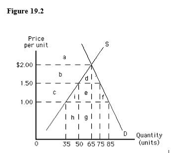
A) c + i + e + f
B) i + f
C) i
D) f
E) b + d
Correct Answer:
Verified
Q33: Which of the following reasons best explains
Q38: The following table shows per-day production data
Q39: The following table shows per-day production data
Q41: The following graph shows U.S. demand for
Q42: The following graph shows the market equilibrium
Q42: Economies of scale in the production of
Q44: The following graph shows U.S. demand for
Q45: The following graph shows U.S. demand for
Q46: The following graph shows the demand for
Q48: When a country imposes a per-unit tariff
Unlock this Answer For Free Now!
View this answer and more for free by performing one of the following actions

Scan the QR code to install the App and get 2 free unlocks

Unlock quizzes for free by uploading documents