The figure given below represents the equilibrium real GDP and price level in the aggregate demand and aggregate supply model.
Figure 8.3
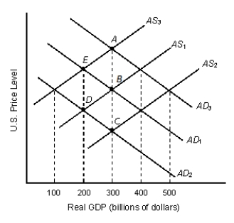
-Consider Figure 8.3. Which of the following is most likely to have led to the movement from point B to point E?
A) Declining net exports
B) Increased investment spending.
C) A decline in the domestic price level.
D) An improvement in the quality of labor.
E) An increase in the real wage rates.
Correct Answer:
Verified
Q81: The interest rate effect suggests that investment
Q83: An increase in aggregate demand normally does
Q87: Government spending is set by the federal
Q90: The figure given below represents the long-run
Q90: An increase in the real value of
Q91: The purchase of fifty new food-processing machines
Q93: The figure given below represents the equilibrium
Q95: The figure given below represents the equilibrium
Q98: A lower domestic price level raises aggregate
Q100: In 2009, a nation reported total imports
Unlock this Answer For Free Now!
View this answer and more for free by performing one of the following actions

Scan the QR code to install the App and get 2 free unlocks

Unlock quizzes for free by uploading documents