Multiple Choice
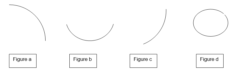
-Which of the shapes in Diagram TB 30.1a look like the long run average cost (LRAC) curve?
A) Figure a
B) Figure b
C) Figure c
D) Figure d
Correct Answer:
Verified
Related Questions
-Which of the shapes in Diagram TB 30.1a look like the long run average cost (LRAC) curve?
A) Figure a
B) Figure b
C) Figure c
D) Figure d
Correct Answer:
Verified

