Multiple Choice
Figure 9-15. The figure below illustrates a tariff. On the graph, Q represents quantity and P represents price.
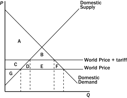
-Refer to Figure 9-15.The deadweight loss created by the tariff is represented by the area
A) B.
B) D + F.
C) D + E + F.
D) B + D + E + F.
Correct Answer:
Verified
Related Questions
Q162: Figure 9-14 Q163: Figure 9-15. The figure below illustrates a Q164: Figure 9-15. The figure below illustrates a
![]()

