Multiple Choice
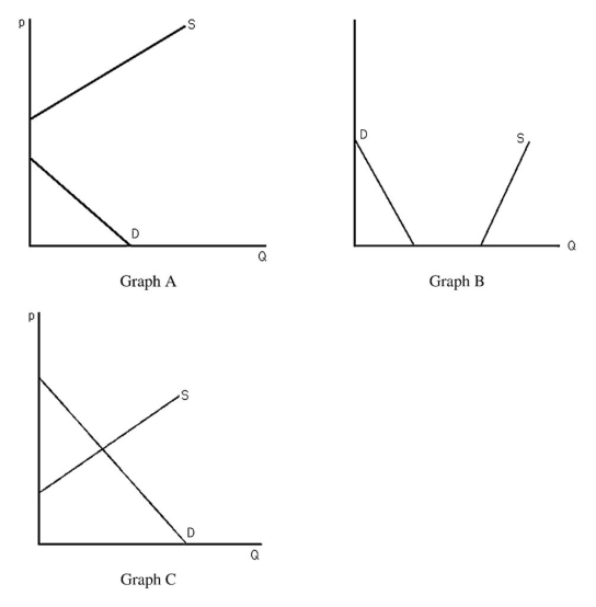
-The above figure shows three different supply-and-demand graphs.Which graph best represents the market for the air we are currently breathing?
A) Graph A
B) Graph B
C) Graph C
D) None of the above.
Correct Answer:
Verified
Related Questions
Q67: Q68: The supply and demand model assumes Q69: Q70: When a market is in disequilibrium consumers Q71: Q73: Lionfish is an aquatic invasive species in Q74: Suppose the market for potatoes can be Q75: A market equilibrium occurs Unlock this Answer For Free Now! View this answer and more for free by performing one of the following actions Scan the QR code to install the App and get 2 free unlocks Unlock quizzes for free by uploading documents![]()
A) no![]()
![]()
A) only with government

