The figure below shows the demand (AD) and supply (SS1) curves of medical care. Figure 18.4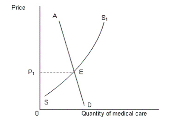
-In Figure 18.4,which of the following regions on the graph represents those people who are not willing and able to pay the price P1 for availing medical care?
A) AE
B) SE
C) AD
D) ED
E) ES1
Correct Answer:
Verified
Q53: Which of the following reasons justifies the
Q54: Which of the following is true of
Q55: Empirical evidences suggest that the expenditure on
Q56: The figure given below represents demand for
Q57: The figure given below represents demand for
Q59: The figure below shows the demand (AD)
Q60: Why does the demand curve for human
Q61: If the ratio of those working to
Q62: Why didn't the supply of medical care
Q63: The results of privatizing the social security
Unlock this Answer For Free Now!
View this answer and more for free by performing one of the following actions

Scan the QR code to install the App and get 2 free unlocks

Unlock quizzes for free by uploading documents