Figure 15.1 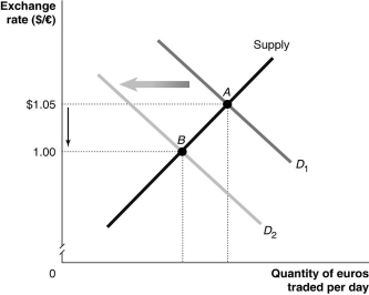 Alt text for Figure 15.1: In figure 15.1, a graph illustrates the quantity of euros traded against the exchange rate.
Long description for Figure 15.1: The x-axis is labelled, quantity of euros traded per day.The y-axis is labelled, exchange rate, Canadian dollar against euro, with values 1.00 and 1.05 marked.An upward sloping supply curve intersects the downward sloping demand curves D1 and D2.The intersection point of S and D1, A, corresponds to the point Canadian dollar 1.05 of the y-axis, and is displayed by a dotted line.The intersection point of S and D2, B, corresponds to the point 1.00 of the y-axis, also displayed by a dotted line.A down arrow is shown between the 2 dotted lines.A bold left arrow points from D1 to D2.Two dotted vertical lines from the intersection points also meet the x-axis.
-Refer to Figure 15.1.Which of the following would cause the change depicted in the figure above?
A) Canadian productivity rises relative to European productivity.
B) Europeans decrease their preferences for Canadian goods relative to European goods.
C) The European Union increases its quotas on French wine.
D) an increase in the price level of Canadian goods relative to European goods
E) the signing of a free trade agreement between the eurozone and Canada
Correct Answer:
Verified
Q70: A Big Mac costs $4.00 in Canada
Q71: A Big Mac costs $4.00 in Canada
Q72: Which of the following explains why purchasing
Q73: The "Big Mac Theory of Exchange Rates"
Q74: If the implied exchange rate between Big
Q76: How will the exchange rate (foreign currency
Q77: Which of the following is a reason
Q78: A Big Mac costs $4.00 in Canada
Q79: Figure 15.2 Q80: Because the value of the euro is![]()
Unlock this Answer For Free Now!
View this answer and more for free by performing one of the following actions

Scan the QR code to install the App and get 2 free unlocks

Unlock quizzes for free by uploading documents