Figure 15.5 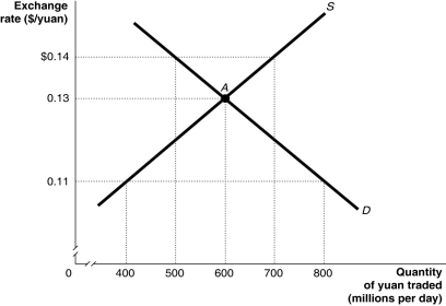 Alt text for Figure 15.5: In figure 15.5, a graph illustrates the quantity of yuan traded against the exchange rate.
Long description for Figure 15.5: The x-axis is labelled, quantity of yuan traded in millions per day.The y-axis is labelled, exchange rate, Canadian dollar against the yuan.Supply curve S, is a straight line which slopes up from the bottom left corner to the top right corner.Demand curve D, is a straight line which slopes down from the top left corner to the bottom right corner.The curves intersect at point A, (600, 0.13) .Point A, and unmarked points (800, 0.11) , (500, $0.14) , (700, $0.14) , and (400, 0.11) are all connected to their corresponding values on the x and y-axes with dotted lines.
-Refer to Figure 15.5.Suppose the pegged exchange rate is $0.11/yuan.Because of safety concerns and numerous product recalls, U.S.consumers lower their demand for Chinese products.Using the figure above, this would
A) increase the surplus of Chinese yuan.
B) decrease the surplus of Chinese yuan.
C) decrease the shortage of Chinese yuan.
D) increase the shortage of Chinese yuan.
E) decrease the value of the Chinese yuan.
Correct Answer:
Verified
Q100: Figure 15.4 Q101: If a country sets a pegged exchange Q102: China began pegging its currency, the yuan, Q103: How were countries whose industries competed with Q104: In the late 1990s, firms in Thailand Q106: South Korea suffered a destabilizing speculation in Q107: Although the pegged exchange rate between the Q108: Thailand's experience with pegging the baht to Q109: Destabilizing speculation refers to Q110: In the late 1990s, when foreign investors![]()
A)actions taken by the
Unlock this Answer For Free Now!
View this answer and more for free by performing one of the following actions

Scan the QR code to install the App and get 2 free unlocks

Unlock quizzes for free by uploading documents