Figure 15.4 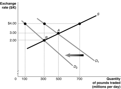 Alt text for Figure 15.4: In figure 15.4, a graph illustrates the quantity of pounds traded against the exchange rate.
Long description for Figure 15.4: The x-axis is labelled, quantity of pounds traded in millions per day.The y-axis is labelled, exchange rate, Canadian dollar against the pound.A straight line supply curve, S, slopes up from the middle left to the top right corner.2 straight line demand curves, D1 and D2, have 2 slightly different slopes.Both curves slope down from the top left corner to the bottom right corner.Curve D2 is plotted to the left of curve D1.The difference between the curves is indicated by a left pointing arrow.Curve S intersects curves D1 and D2 at points A (500, 3.00) and B (300, 2.00) .Point (300, 4.00) is plotted near the top of curve D1, and point (100, 4.00) is plotted near the top of curve D2.All points are connected to their corresponding values on the x and y-axes with dotted lines.
-Refer to Figure 15.4.The equilibrium exchange rate is originally at A, $3/pound.Suppose the British government pegs its currency at $4/pound.Speculators expect that the value of the pound will drop and this shifts the demand curve for pounds to D2.If the government abandons the peg, the equilibrium exchange rate would be
A) more than $4/pound.
B) $4/pound.
C) $3/pound.
D) $2/pound.
E) less than $2/pound.
Correct Answer:
Verified
Q95: Figure 15.5 Q96: Should European nations which are not currently Q97: What explains the appreciation of the Japanese Q98: Which of the following is a drawback Q99: By 2015, how many European countries were Q101: If a country sets a pegged exchange Q102: China began pegging its currency, the yuan, Q103: How were countries whose industries competed with Q104: In the late 1990s, firms in Thailand Q105: Figure 15.5 ![]()
![]()
Unlock this Answer For Free Now!
View this answer and more for free by performing one of the following actions

Scan the QR code to install the App and get 2 free unlocks

Unlock quizzes for free by uploading documents