Figure 15.5 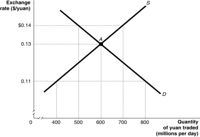 Alt text for Figure 15.5: In figure 15.5, a graph illustrates the quantity of yuan traded against the exchange rate.
Long description for Figure 15.5: The x-axis is labelled, quantity of yuan traded in millions per day.The y-axis is labelled, exchange rate, Canadian dollar against the yuan.Supply curve S, is a straight line which slopes up from the bottom left corner to the top right corner.Demand curve D, is a straight line which slopes down from the top left corner to the bottom right corner.The curves intersect at point A, (600, 0.13) .Point A, and unmarked points (800, 0.11) , (500, $0.14) , (700, $0.14) , and (400, 0.11) are all connected to their corresponding values on the x and y-axes with dotted lines.
-Refer to Figure 15.5.Suppose the Chinese government decides to abandon pegging the yuan to the U.S.dollar at a rate which undervalues the yuan.Using the figure above, the equilibrium exchange rate would be ________ and Chinese exports to the United States would ________ in price.
A) $0.11/yuan; decrease
B) $0.11/yuan; increase
C) $0.14/yuan; increase
D) $0.13/yuan; increase
E) $0.13/yuan; decrease
Correct Answer:
Verified
Q90: If a country's currency is "pegged" to
Q91: Members of the European Union decided to
Q92: Figure 15.4 Q93: The central bank of the European Union Q94: Which of the following is not an Q96: Should European nations which are not currently Q97: What explains the appreciation of the Japanese Q98: Which of the following is a drawback Q99: By 2015, how many European countries were Q100: Figure 15.4 ![]()
![]()
Unlock this Answer For Free Now!
View this answer and more for free by performing one of the following actions

Scan the QR code to install the App and get 2 free unlocks

Unlock quizzes for free by uploading documents