The figure below shows the demand and supply curves for pollution abatement. 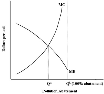 FIGURE 17-3
-Refer to Figure 17-3.On the horizontal axis,the label "Qt(100% abatement) " refers to
A) the maximum pollution abatement that is cost effective.
B) the maximum pollution abatement attainable at the lowest cost.
C) the maximum pollution abatement attainable with given technology.
D) zero remaining pollution.
E) zero pollution abatement.
Correct Answer:
Verified
Q53: The marginal benefit of reducing pollution and
Q54: The figure below shows the demand and
Q55: The table below shows the marginal benefit
Q56: The figure below shows the demand and
Q57: Suppose a farm that is polluting an
Q59: The diagram below shows the private and
Q60: Suppose a farm that is polluting an
Q61: All of the following are examples of
Q62: The diagram below shows the marginal cost
Q63: The diagram below shows the marginal costs
Unlock this Answer For Free Now!
View this answer and more for free by performing one of the following actions

Scan the QR code to install the App and get 2 free unlocks

Unlock quizzes for free by uploading documents