Figure 36-3.The left-hand graph shows a short-run aggregate-supply (SRAS) curve and two aggregate-demand (AD) curves.On the left-hand diagram,Y represents output and on the right-hand diagram,U represents the unemployment rate. 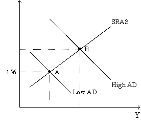
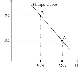
-Refer to Figure 36-3.Assume the figure charts possible outcomes for the year 2018.In 2018,the economy is at point B on the left-hand graph,which corresponds to point B on the right-hand graph.Also,point A on the left-hand graph corresponds to A on the right-hand graph.The price level in the year 2018 is
A) 155.56.
B) 159.00.
C) 163.50.
D) 170.04.
Correct Answer:
Verified
Q7: In his famous article published in an
Q8: Figure 36-1.The left-hand graph shows a short-run
Q9: In the late 1960s,Milton Friedman and Edmund
Q9: In the long run,
A)the natural rate of
Q16: Figure 36-1.The left-hand graph shows a short-run
Q19: Samuelson and Solow argued that a combination
Q30: Which of the following leads to a
Q51: If the natural rate of unemployment falls,
A)both
Q57: A policy that raised the natural rate
Q111: A basis for the slope of the
Unlock this Answer For Free Now!
View this answer and more for free by performing one of the following actions

Scan the QR code to install the App and get 2 free unlocks

Unlock quizzes for free by uploading documents