The following image shows the market equilibrium for opera tickets. The graph shows that a demand curve for opera tickets, labeled D and a supply curve of opera tickets, labeled S. Area _____ represents the maximum amount that consumers are willing to pay for 10 opera tickets?.
Figure 6.7
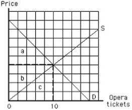
A) a
B) b
C) c
D) a + b + c
E) a + b
Correct Answer:
Verified
Q119: If a consumer buys a good,the expected
Q119: The following image shows the demand curve
Q122: Demand for a service like medical care:
A)is
Q125: If medical care is provided free of
Q126: At a zero price, the consumer surplus
Q127: If Joel buys ten floppy disks, which
Q128: The following diagram shows the market equilibrium
Q148: Consumers derive consumer surplus when _
A)the monetary
Q150: A consumer might buy from a high-priced
Q154: People who use drive-through windows at restaurants
Unlock this Answer For Free Now!
View this answer and more for free by performing one of the following actions

Scan the QR code to install the App and get 2 free unlocks

Unlock quizzes for free by uploading documents