The following graph shows the market for pollution rights. An increase in demand indicates ______.
Figure 17.4
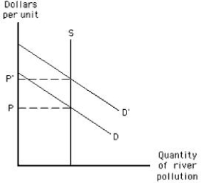
A) a rise in pollution
B) increased environmental damage
C) an increase in the price of the right to pollute
D) an increase in the benefit of cleaning up the pollution
E) an increase in the cost of cleaning up the river
Correct Answer:
Verified
Q89: The marginal social benefit curve for water
Q98: The following graph shows the market for
Q99: A meditation class meets on the second
Q101: The following graph shows the market for
Q102: A major source of water pollution in
Q118: Which of the following would happen if
Q124: Control of water pollution from pesticide runoff
Q129: Suppose environmental groups pressure the local government
Q130: The Clean Air Act of 1970 _
A)set
Q131: The Clean Air Act of 1970 has
Unlock this Answer For Free Now!
View this answer and more for free by performing one of the following actions

Scan the QR code to install the App and get 2 free unlocks

Unlock quizzes for free by uploading documents