Exhibit 2-10.Automobiles traveling on a road with a posted speed limit of 65 miles per hour are checked for speed by a state police radar system.The following table is a frequency distribution of speeds. 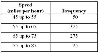 Refer to Exhibit 2-10.When using a polygon to graph quantitative data,what does each point represent?
A) The lower limit of a particular class and its width
B) The midpoint of a particular class and its associated frequency or relative frequency
C) The midpoint of a particular class and its associated cumulative frequency or cumulative relative frequency
D) The upper limit of a particular class and its associated cumulative frequency or cumulative relative frequency
Correct Answer:
Verified
Q40: Exhibit 2-4.Students in Professor Smith's Business Statistics
Q41: Exhibit 2-7.Thirty students at Eastside High School
Q42: Exhibit 2-10.Automobiles traveling on a road with
Q43: Exhibit 2-8.Consider the following frequency distribution.
Q44: Exhibit 2-10.Automobiles traveling on a road with
Q46: Exhibit 2-9.An analyst constructed the following frequency
Q47: Exhibit 2-7.Thirty students at Eastside High School
Q48: Exhibit 2-8.Consider the following frequency distribution.
Q49: Exhibit 2-9.An analyst constructed the following frequency
Q50: The following histogram represents the number of
Unlock this Answer For Free Now!
View this answer and more for free by performing one of the following actions

Scan the QR code to install the App and get 2 free unlocks

Unlock quizzes for free by uploading documents