
Use the figure to answer the following question.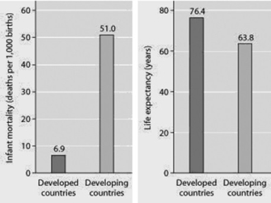
Infant mortality and life expectancy at birth in developed and developing countries (data as of 2005) .
What is a logical conclusion that can be drawn from the graphs? Developed countries have ________.
A) lower infant mortality rates and lower life expectancy than developing countries
B) higher infant mortality rates and lower life expectancy than developing countries
C) lower infant mortality rates and higher life expectancy than developing countries
D) higher infant mortality rates and higher life expectancy than developing countries
Correct Answer:
Verified
Q44: A population of white-footed mice becomes severely
Q49: Use the graphs to answer the following
Q50: Which of the following statements regarding the
Q51: Use the figure to answer the following
Q52: Which of the following graphs illustrates the
Q53: Use the figure to answer the following
Q56: Use the graph to answer the following
Q57: Use the figure to answer the following
Q58: Which of the following statements about human
Q59: In which of the following situations would
Unlock this Answer For Free Now!
View this answer and more for free by performing one of the following actions

Scan the QR code to install the App and get 2 free unlocks

Unlock quizzes for free by uploading documents