Figure 15.4 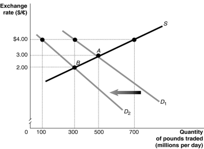 Alt text for Figure 15.4: In figure 15.4, a graph illustrates the quantity of pounds traded against the exchange rate.
Long description for Figure 15.4: The x-axis is labelled, quantity of pounds traded in millions per day.The y-axis is labelled, exchange rate, Canadian dollar against the pound.A straight line supply curve, S, slopes up from the middle left to the top right corner.2 straight line demand curves, D1 and D2, have 2 slightly different slopes.Both curves slope down from the top left corner to the bottom right corner.Curve D2 is plotted to the left of curve D1.The difference between the curves is indicated by a left pointing arrow.Curve S intersects curves D1 and D2 at points A (500, 3.00) and B (300, 2.00) .Point (300, 4.00) is plotted near the top of curve D1, and point (100, 4.00) is plotted near the top of curve D2.All points are connected to their corresponding values on the x and y-axes with dotted lines.
-Refer to Figure 15.4.The equilibrium exchange rate is at A, $3/pound.Suppose the British government pegs its currency at $4/pound.Speculators expect that the value of the pound will drop and this shifts the demand curve for pounds to D2.After the shift,
A) there is a shortage of pounds equal to 600 million.
B) there is a surplus of pounds equal to 400 million.
C) there is a shortage of pounds equal to 400 million.
D) there is a surplus of pounds equal to 600 million.
E) there is a shortage of pounds equal to 200 million.
Correct Answer:
Verified
Q78: A Big Mac costs $4.00 in Canada
Q79: Figure 15.2 Q80: Because the value of the euro is Q81: A currency pegged at a value below![]()

