The following graph shows U.S. demand for and supply of a good. Suppose the world price of the good is $1.00 per unit and a specific tariff of $0.50 per unit is imposed on each unit of imported good. In such a case, net welfare loss as a result of a tariff of $0.50 per unit is represented by the area ____.
Figure 19.2
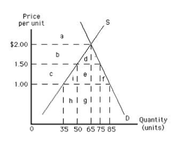
A) c + i + e + f
B) i + f
C) i
D) f
E) b + d
Correct Answer:
Verified
Q48: When a country imposes a per-unit tariff
Q59: The world demand for and the world
Q61: An effective import quota:
A)lowers the price of
Q86: The difference between the effects of an
Q95: The following image shows the market for
Q96: The following graph shows the supply of
Q98: The following graph shows the supply of
Q100: The following graph shows the supply of
Q103: The following graph shows the demand for
Q104: The following graph shows the demand for
Unlock this Answer For Free Now!
View this answer and more for free by performing one of the following actions

Scan the QR code to install the App and get 2 free unlocks

Unlock quizzes for free by uploading documents