Here are 3 boxplots of weekly gas prices at a service station in the U.S.A.(price in $ per gallon) .Compare the distribution of prices over the three years. 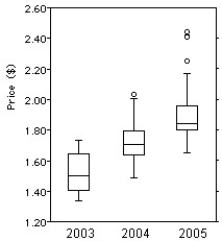
A) Gas price have been increasing on average over the 3-year period,but the spread has been decreasing.The distribution has been skewed to the left,and there were 3 high outliers in 2005.
B) Gas price have been increasing on average over the 3-year period,and the spread has been increasing as well.The distribution has been skewed to the right,and there were 3 high outliers in 2005.
C) Gas price have been decreasing on average over the 3-year period,and the spread has been decreasing.The distribution has been skewed to the left,and there were 3 high outliers in 2005.
D) Gas price have been decreasing on average over the 3-year period,but the spread has been increasing.The distribution has been skewed to the right,and there were 3 high outliers in 2005.
E) Gas price have been increasing on average over the 3-year period,and the spread has been increasing as well.The distribution has been skewed to the left,and there were 3 high outliers in 2005.
Correct Answer:
Verified
Q13: The histograms show the cost of living,in
Q14: The centre for health in a certain
Q15: How would you describe the shape of
Q16: Which class had the smallest standard deviation?
A)Class
Q17: The back-to-back stem-and-leaf display compares the
Q19: Which class had the smallest IQR?
A)Class 1,because
Q20: Which class had the highest mean score?
A)Class
Q21: Here are the summary statistics for
Q22: The following stem-and-leaf display shows the
Q23: The times,in minutes,it took for 21 students
Unlock this Answer For Free Now!
View this answer and more for free by performing one of the following actions

Scan the QR code to install the App and get 2 free unlocks

Unlock quizzes for free by uploading documents