The following table shows the percentage of e-mail that is sent each day of the business week according to an Intermedia survey. 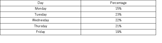 Which of the following best displays this data?
A) Horizontal bar chart
B) Vertical bar chart
C) Pie chart
D) Histogram
Correct Answer:
Verified
Q81: Graphically, we can show a(n) _ _
Q84: What type of relationship is indicated in
Q85: Use the following data to construct a
Q86: The following frequency distribution shows the frequency
Q87: Consider the following stem-and-leaf diagram. 
Q88: The Statistical Abstract of the United States,2010
Q91: The following stem-and-leaf diagram shows the last
Q92: What type of relationship is indicated in
Q93: The manager at a water park constructed
Q94: A survey conducted by CBS news asked
Unlock this Answer For Free Now!
View this answer and more for free by performing one of the following actions

Scan the QR code to install the App and get 2 free unlocks

Unlock quizzes for free by uploading documents