The graph below is a plot of the fuel efficiency (in miles per gallon,or mpg) of various cars versus the weight of these cars (in thousands of pounds) . 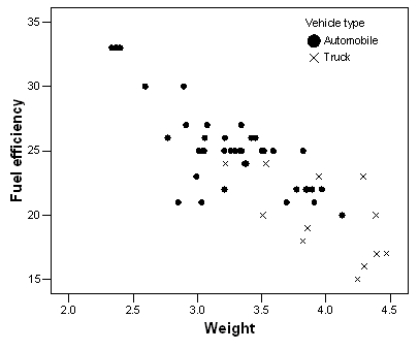 The points denoted by the plotting symbol × correspond to pick-up trucks and SUVs.The points denoted by the plotting symbol . correspond to automobiles (sedans and station wagons) .What can we conclude from this plot?
A) There is little difference between trucks and automobiles.
B) Trucks tend to be higher in weight than automobiles.
C) Trucks tend to get poorer gas mileage than automobiles.
D) The plot is invalid.A scatterplot is used to represent quantitative variables,and the vehicle type is a qualitative variable.
E) Both B and C
Correct Answer:
Verified
Q1: A researcher measured the height (in feet)and
Q2: We are interested in determining if students
Q3: Fill in the blank.A researcher is interested
Q4: Variables measured on the same cases are
Q5: Fill in the blank.A study is conducted
Q7: A researcher measured the height (in feet)and
Q8: The scatterplot below displays data collected from
Q9: A variable that explains or causes change
Q10: The scatterplot below displays data collected from
Q11: The scatterplot below displays data collected from
Unlock this Answer For Free Now!
View this answer and more for free by performing one of the following actions

Scan the QR code to install the App and get 2 free unlocks

Unlock quizzes for free by uploading documents