The scatterplot below displays data collected from 20 adults on their age and overall GPA at graduation. 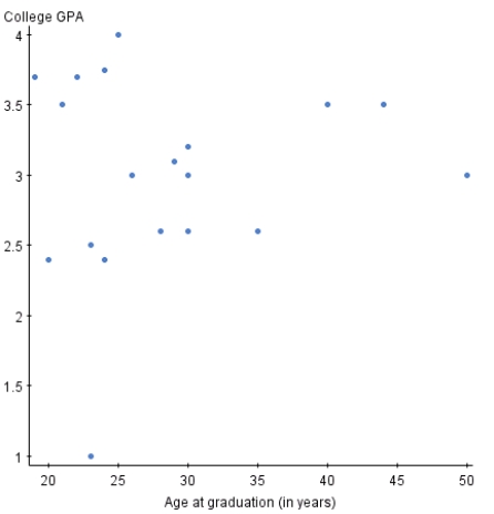
If you switched the variables on the x and y axis,the relationship between the two variables would appear much stronger.
Correct Answer:
Verified
Q5: Fill in the blank.A study is conducted
Q6: The graph below is a plot of
Q7: A researcher measured the height (in feet)and
Q8: The scatterplot below displays data collected from
Q9: A variable that explains or causes change
Q11: The scatterplot below displays data collected from
Q12: Volunteers for a research study were divided
Q13: Two variables are _ if knowing the
Q14: Fill in the blank.When creating a scatterplot,one
Q15: Fill in the blank.The owner of a
Unlock this Answer For Free Now!
View this answer and more for free by performing one of the following actions

Scan the QR code to install the App and get 2 free unlocks

Unlock quizzes for free by uploading documents