The bar graph shows the increasing life expectancy of males in the United States from 1930 to 2010. Use this graph. Between what two decades shown on the graph did the life expectancy increase by approximately one years? 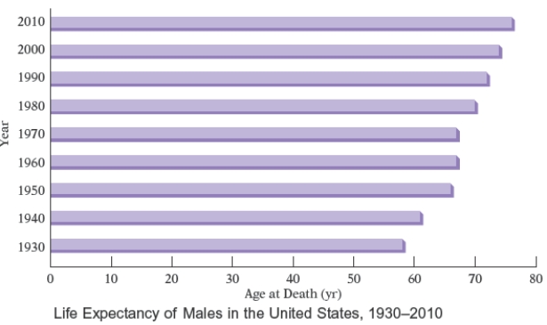
A) 1940 and 1960
B) 1940 and 1950
C) 1950 and 1960
D) 1960 and 1950
E) 1960 and 1970
Correct Answer:
Verified
Q35: A nurse monitors the blood glucose levels
Q36: The broken-line graph shows the percent of
Q37: The double-broken-line graph shows the number of
Q38: The bar graph shows the increasing life
Q39: The bar graph shows the increasing life
Q41: Most health statistics list normal body
Q42: The total cholesterol readings for 40 female
Q43: The frequency polygon Figure shows the approximate
Q44: The heights, in inches, of the women
Q45: Most health statistics list normal body temperature
Unlock this Answer For Free Now!
View this answer and more for free by performing one of the following actions

Scan the QR code to install the App and get 2 free unlocks

Unlock quizzes for free by uploading documents