The following bar graph presents the average amount a certain family spent, in dollars, on food categories in a recent year.
On which food category was the most money spent?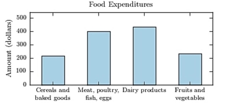
various
A) Cereals and baked goods
B) Fruits and vegetables
C) Dairy products
D) Meat poultry, fish, eggs
Correct Answer:
Verified
Q66: The following pie chart presents the percentages
Q67: A sample of 200 high school
Q68: Thirty households were surveyed for the
Q69: 
Q70: Q72: The following frequency distribution presents the Q73: Following is a pie chart that Q74: The following frequency distribution presents the
Unlock this Answer For Free Now!
View this answer and more for free by performing one of the following actions

Scan the QR code to install the App and get 2 free unlocks

Unlock quizzes for free by uploading documents