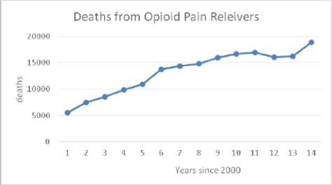
The following time plot gives the number of deaths from opioid pain relievers in the years 2001 to 2014.
Which of the following statements is TRUE about the data?
A) There is a fairly steady upward trend in the number of deaths from opioid pain relievers over this entire time period.
B) The number of deaths for 2012 is a clear outlier.
C) The time period is too short to describe any pattern in the data.
D) None of these choices is correct.
Correct Answer:
Verified
Q28: The following dotplot shows migraine intensity (on
Q29: The following histogram depicts the prevalence rates
Q30: The following histogram shows the yearly number
Q31: The following histogram shows the yearly number
Q32: The following graph shows the percent of
Q33: Opioid pain relievers are prescribed at a
Q35: Every month, the Gallup polling organization tracks
Q36: Every month, the Gallup polling organization tracks
Q37: The U.S. Global Change Research Program examined
Q38: The U.S. Global Change Research Program examined
Unlock this Answer For Free Now!
View this answer and more for free by performing one of the following actions

Scan the QR code to install the App and get 2 free unlocks

Unlock quizzes for free by uploading documents