The following histogram depicts the prevalence rates of a particular genetic marker in samples among 25 impoverished communities in 2004. In each interval, the left endpoint is included but not the right endpoint, so the class intervals are 10 ≤ rate < 15, 15 ≤ rate < 20, . . . .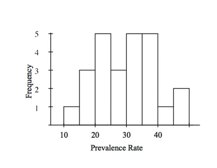
How many communities have a prevalence rate of 30% or higher?
A) 5
B) 12
C) 10
D) 13
Correct Answer:
Verified
Q24: The estimated annual number of smoking-attributable
Q25: The following histogram shows body temperatures (in
Q26: The following histogram shows body temperatures (in
Q27: A sample of 40 endangered species was
Q28: The following dotplot shows migraine intensity (on
Q30: The following histogram shows the yearly number
Q31: The following histogram shows the yearly number
Q32: The following graph shows the percent of
Q33: Opioid pain relievers are prescribed at a
Q34: The following time plot gives the number
Unlock this Answer For Free Now!
View this answer and more for free by performing one of the following actions

Scan the QR code to install the App and get 2 free unlocks

Unlock quizzes for free by uploading documents